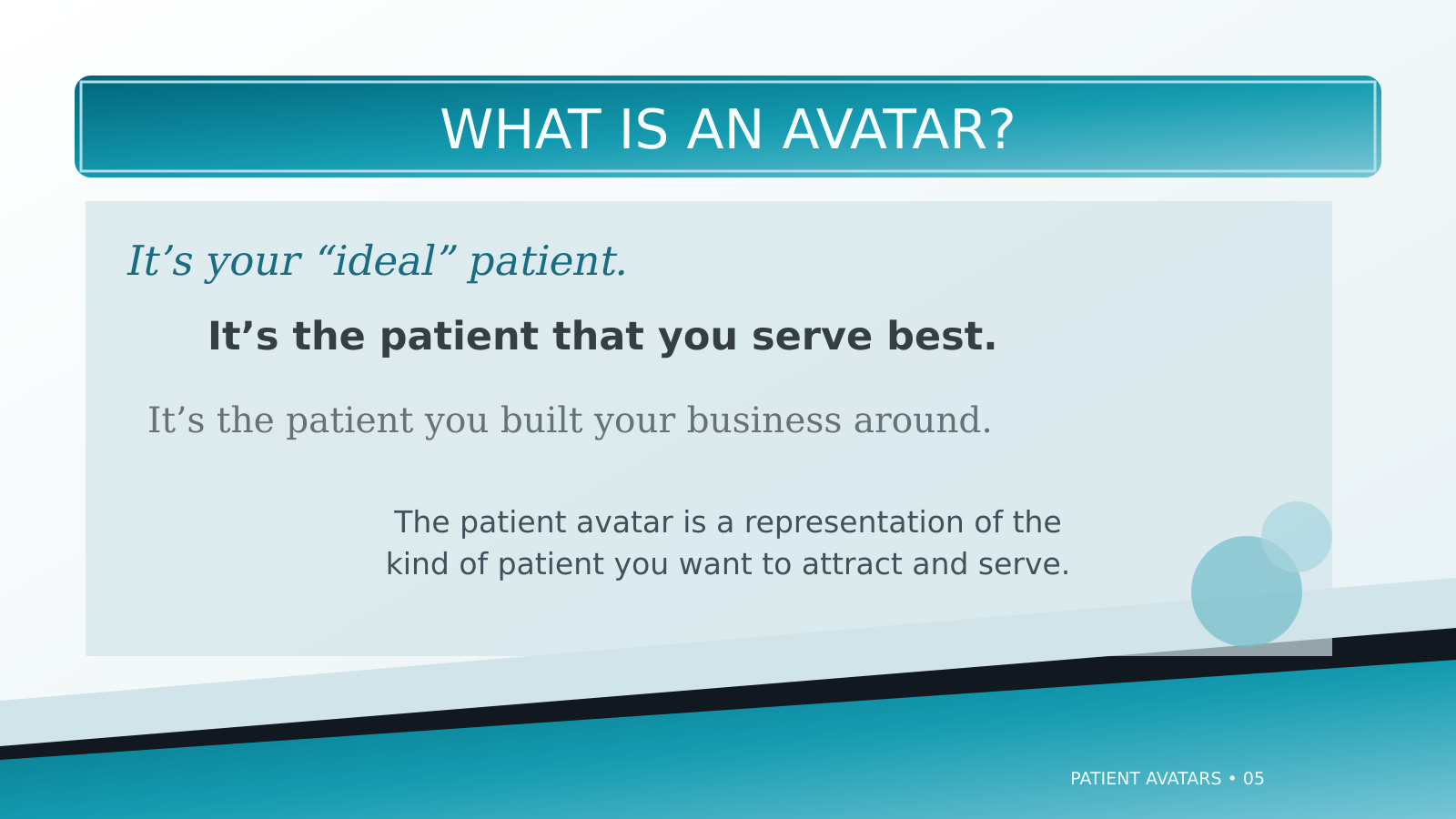
A dental practice owner had a great message for a big conference, but the slide deck was a problem. The old presentation was packed with long walls of text and low-contrast colors. Instead of making the owner look like an expert, this poor design risked hurting the brand on stage.
Role
Presentation Designer & Content Editor
Audience
Dental practice leaders attending a major dental conference.
Deliverables
Redesigned Presentation & Implementation Guide
Tools
PowerPoint, Photoshop & InDesign
The Strategy
Replace the soft, spa-inspired look with a confident visual style suited to a conference audience. Use bold typography, high contrast, and fewer words per slide to make each idea clear at a glance and give the speaker room to lead the discussion.
The Redesign
Enhanced Readability
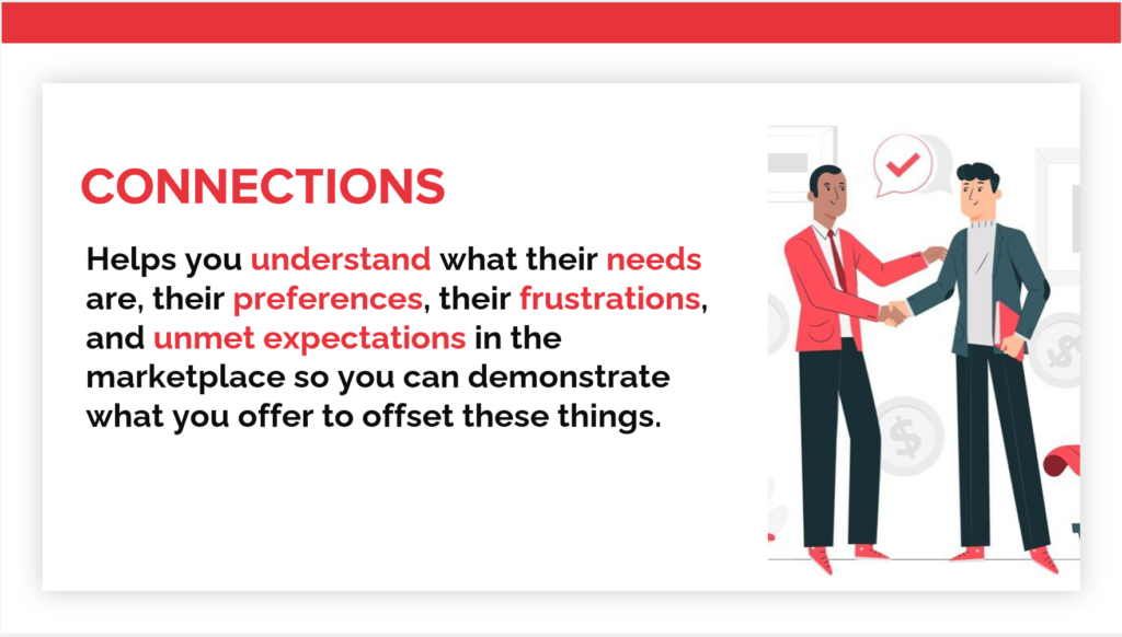
I replaced the soft, low-contrast visuals with bold typography and sharp colors. This confident design projects authority while optimizing the slides for visibility in a large venue.
One idea per slide
Each slide now makes one clear point with bold text and colors that are easy to see from the back of the room. Character graphics help the audience understand what a patient avatar is without adding more words.
The Outcome
The project delivered a polished presentation designed to keep the audience engaged at a major industry event. I made sure every slide was easy to read in a large venue, allowing the speaker to deliver their message without distraction. These new visual guidelines give the practice a reliable, easy-to-update foundation for all future speaking engagements.